The Whistling Elk celebrated 33 years of “Stayin’ Alive” on May 1st, 2023 having opened the doors in May of 1990!!!
Yeah, I look at it as “STAYIN’ ALIVE” hahaha 33 years – who knew?
It seems incredible to me that so much time has passed, so many things have changed over the years, so many businesses have come and gone, so many economic ups and downs, so many technology changes…remember no computers? remember Y2K, etc. I have so few pictures of the shop back in the beginning because there was no snapping a picture on your phone. Crazy, huh?
I have never deviated from The Whistling Elk’s original business plan which was to provide Home Decor & Accessories, Interior Design and Gifts based on Old World Elegance and Traditions. That’s right, I’ve seen the trends and the fads come and go and stayed away. Why? Because Old World Elegance, Sophistication and Tradition will never go out of style! Nope. It will be STAYIN’ ALIVE forever.
I can’t say I might not have been tempted a time or two….but nah….
Thirty-Three Years…Amazing!! I can’t even count how many happy customers I have had or how many clients I have provided Interior Design Services to — but of course it is all because of THEM and their love of Tradition, Elegance, European Old World Style, and the love of Color and Warmth in their homes.
The Whistling Elk has been recognized not once but twice as one of the 50 Best Home Furnishings Shops in the USA. I am still so very honored by this fact! I have designed rooms at 5 or 6 Designer Show Houses over the years…the most strenuous and challenging of those the Montclair Jr. Leaque Showhouse “Brookwood”.
I totally enjoyed traveling to SHOP High Point, North Carolina and Atlanta, Georgia (twice a year for over 30 years) and of course Paris, France. How much fun was that! So many adventures and stories!
I have seen so many business come and go and who knew that “STAYIN’ ALIVE” meant I would become one of the “oldest” businesses on Main Street? I am so Grateful to my loyal customers for this HONOR.
This year for the Anniversary Sale I am going to do something I have never done before! Thank you for Everything!
There is really nothing more beautiful to me than the elegance of a room design incorporating glorious colour and the changing winds of home decor are bringing colour back!
Warm. Cozy. Timeless
I can’t imagine anything better than that.
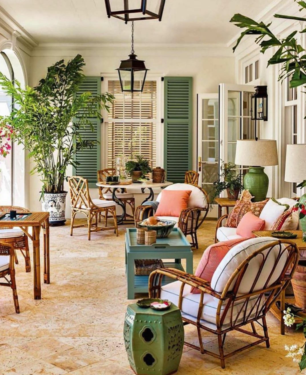
Lovely Florida home by G.P. Schafer featured in Luxe Magazine.
Designers who create rooms incorporating traditional looks with a few clean contemporary accents or some wonderful vintage or antique pieces take my breath away and make my heart beat. Beautiful design can always do that to me.
Obviously colour is a major factor in the design of all beautiful rooms. Although I enjoyed the grey/whites and accompanying pale palette that was trending...it is cold…Brrrh! I think that everyone staying home during the covid pandemic spent a lot of time looking around and deciding to make some changes in their homes especially related to reintoducing colour…putting the colour revolution on the fast track!
What do you think? Are you ready to move on to some great color and tradition? or will you holding on to the cooler palettes?
Change on the wholesale level is already in full swing so you are going to find less of the outgoing trends and colours.
Have you ever looked for home decor and accents in colors that have recently passed out of favor? Then you know how hard it can be to find them. When the market starts to transition it is always wise to finish a room before home accents become scarce.
Personally, I am wholeheartedly embracing the return of color!
Magnificent beach house foyer by interior designer Jack Philips. Photo by Brantley Photo
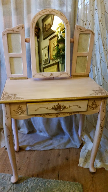
I love the way Janelle of Janelle’s Designs made this vanity stand out by incorporating Gold!
A touch of gold on gray makes this vanity stand out! Photographed and Painted by Janells Designs. You can find Janell on instagram @janellsdesigns
There is really nothing like a beautiful Traditional
room design.
Warm. Cozy. Timeless.
I can’t imagine anything better than that.
Amazing family room by Alexa Hampton Inc. Love the use of Color!!
Designers who create rooms incorporating Traditional looks with a few clean modern accents or maybe some wonderful vintage or antique pieces take my breath away and make my heart beat. Beautiful design can always do that to me.
Obviously color is a major factor in the design of the warm, cozy Traditional room. Although I enjoyed the greys and accompanying pale palette that has been trending...it is cold…Brrrh! So I am not so sad to see it trending down and away.
What do you think? Are you ready to move on to some great color and tradition? or will you be trying to hold on to the cooler palettes?
Once change starts on the wholesale level you will start finding less and less of the outgoing trends and colors. It takes a little time to transition and longer still for the retail customer to embrace the next trend.
Often customers will look for decorative accessories and accents in colors that have recently passed out of favor and they become extremely hard to find…sadly I’m sure that on occasion you have experienced this.
When the market starts to transition it is always wise to finish a room before accents become more scarce.
Taken from designer Michael Smith’s book “The Curated House: Creating Style, Beauty and Balance”.
Personally, I am wholeheartedly embracing the return of color!
…They ask this when they are standing in my shop amidst the furniture and home accessories that are displayed in The Whistling Elk.
I usually just shrug off this question because I have never really thought much about it – until recently…you see I just sold my home. A short few words but a lot of meaning!
Taking stock and packing I realized just how consistent I really am…there is a resemblance in that I really love to be surrounded by beauty. I guess if I am one thing…that is…Consistent !!
I have lived in my home for 28 years…it feels like a part of me. It always felt good just to be there. Over the years I have brought home pieces that I loved and integrated them into the mix. Some things came and went while others I cannot imagine parting with ever.
Living Room
My list of belongings reads like a list of the companies that I have done business with over the years in the shop.
I have a J.M. Paquet sofa…they are out of business now being one of the ones to go early in 2008. but the sofa lives on and when the time comes I will have it reslipcovered yet again. Its so comfortable and I still love it so it will go with me to my new home.
My Habersham buffet is another piece that I love. It makes me happy every time I just look at it. It houses my grandmothers dishes which will be going to my niece for safekeeping. The buffet though goes with me. The savonnerie carpet is from Feizy…and it was chosen because…well, I just fell in love with it.
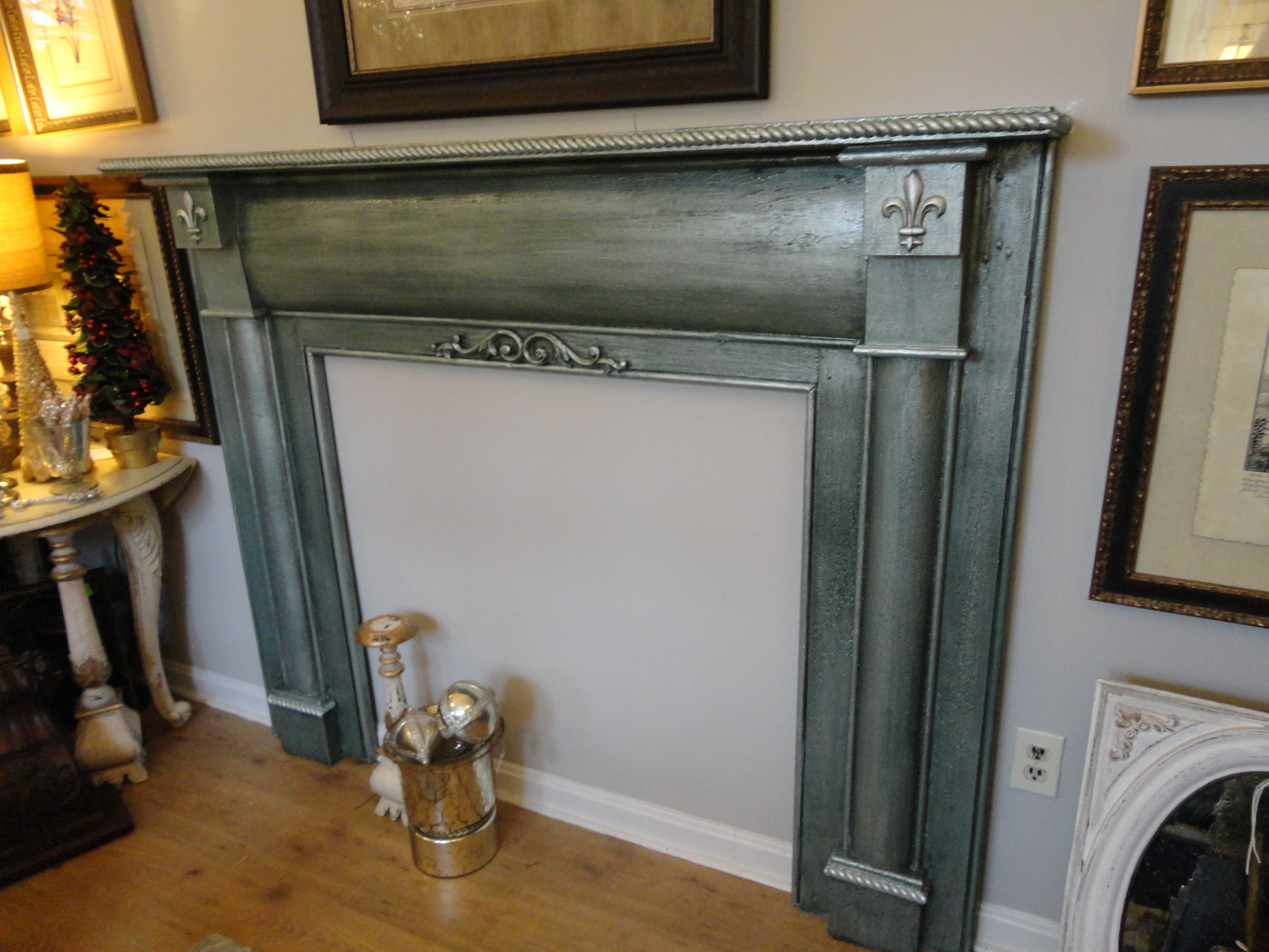
I love this room and have spent many, many hours here! The mantel I bought when a 1890’s home in New Brunswick was demolished. It was a wreck all chipping and dirty. I took my hand sander and sanded all the dirt and loose paint off and then had it attached to the wall.
Since I have always wanted to live in an old fieldstone house I mimicked that with the faux painted fieldstone wall on which that mantel is mounted. I loved this look and am sorry to leave it behind. I guess I will have to paint a new wall!
1890’s mantel
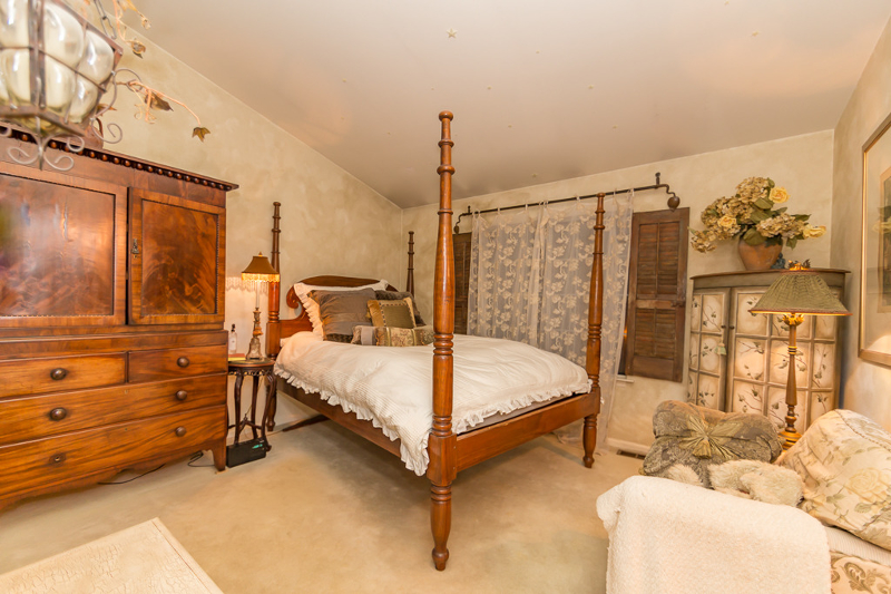
Another favorite room is the Master Bedroom…and Master Bath off of it…
I purchased a really crummy pair of shutters and nailed them to the wall on either side of a large window and it created just the right look to go with the Dutch Caribbean bed. I cannot remember the name of the company that this bed came from but it is solid hand carved mahogany.
Another Favorite Room
The beautiful painted lingerie chest fit just perfectly in the corner of the room…it’s shape is what makes it special. It’s rounded across the front. It came from RH Home…they were a California company which is also gone. Sadly.
The walls I faux painted to resemble my take on old crumbling Italian walls…and you can’t see it in the picture but on the wall at the foot of the bed is a huge 5 foot x 4 foot picture of a hotel on Lake Como Italy which I have to say I loved waking up and seeing every morning. Perfect way to start the day!
The Linen Press next to the bed is an antique piece from England circa 1880…my niece will be picking up this piece tonight and it will go to live in her bedroom. It came from a company called ARK Antiques which is also out of business…so many great companies over the years have come and gone. Sadly our economy is not good for small business these days.
Master Bath
I really got fanciful with my master bath. The Alma Slade draperies are chenille and were perfect with the colors in the Nourison carpet. But my favorite piece is the Danish Vanity from ARK Antiques…circa 1910. So pretty! And of course I just had to have a little vintage chandelier in there…Right? Absolutely!
I have a thing about old doors and I managed to get my fix with that too in the dining room where I leaned two heavy old French doors to flank a 3 panel screen…an oil from Andrew Kolb & Sons depicting a hillside village in Italy. That’s the only non-bling (Stone County Ironworks) chandelier I own over that table!!! I always meant to hang some crystals on it…
Dining Room
So I guess this is my tribute to my pretty little home that I am leaving behind. I will miss it. A little place always filled with light from all the large windows. But I am also so excited to start over and to what I am going to create next!
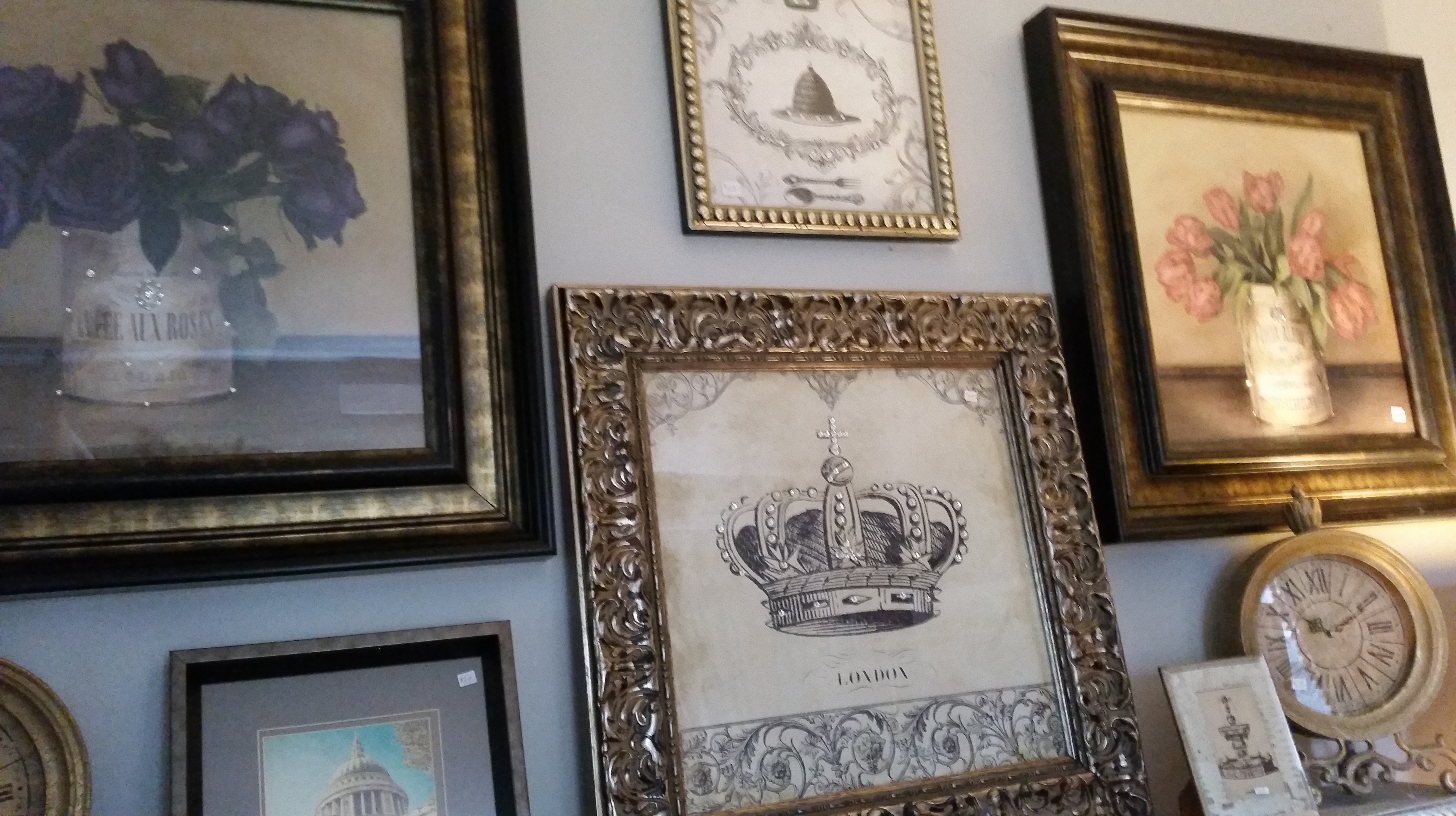
The latest shipment of artwork came yesterday. There were two boxes (one of them over 6′ high) on a big skid….it was a hot day to contemplate opening that much freight.
But as always when I started to take out all the different pieces of artwork I got excited because it was all beautiful and nothing was broken…that in itself was a miracle since this particular shipment was actually on the road for 20 days. So now there is lots of beautiful artwork again at The Whistling Elk!
Here’s a sampling of some of the pieces that arrived…come check them out…there’s more!
Our newest “Lady” – beautiful…but we have the Lady in Black too…
Gorgeous Giglee at The Whistling Elk, Chester NJ
Giclee Still Life (part of a set of 4)
Wall Art Arrivals at The Whistling Elk (these frames are distressed gold)
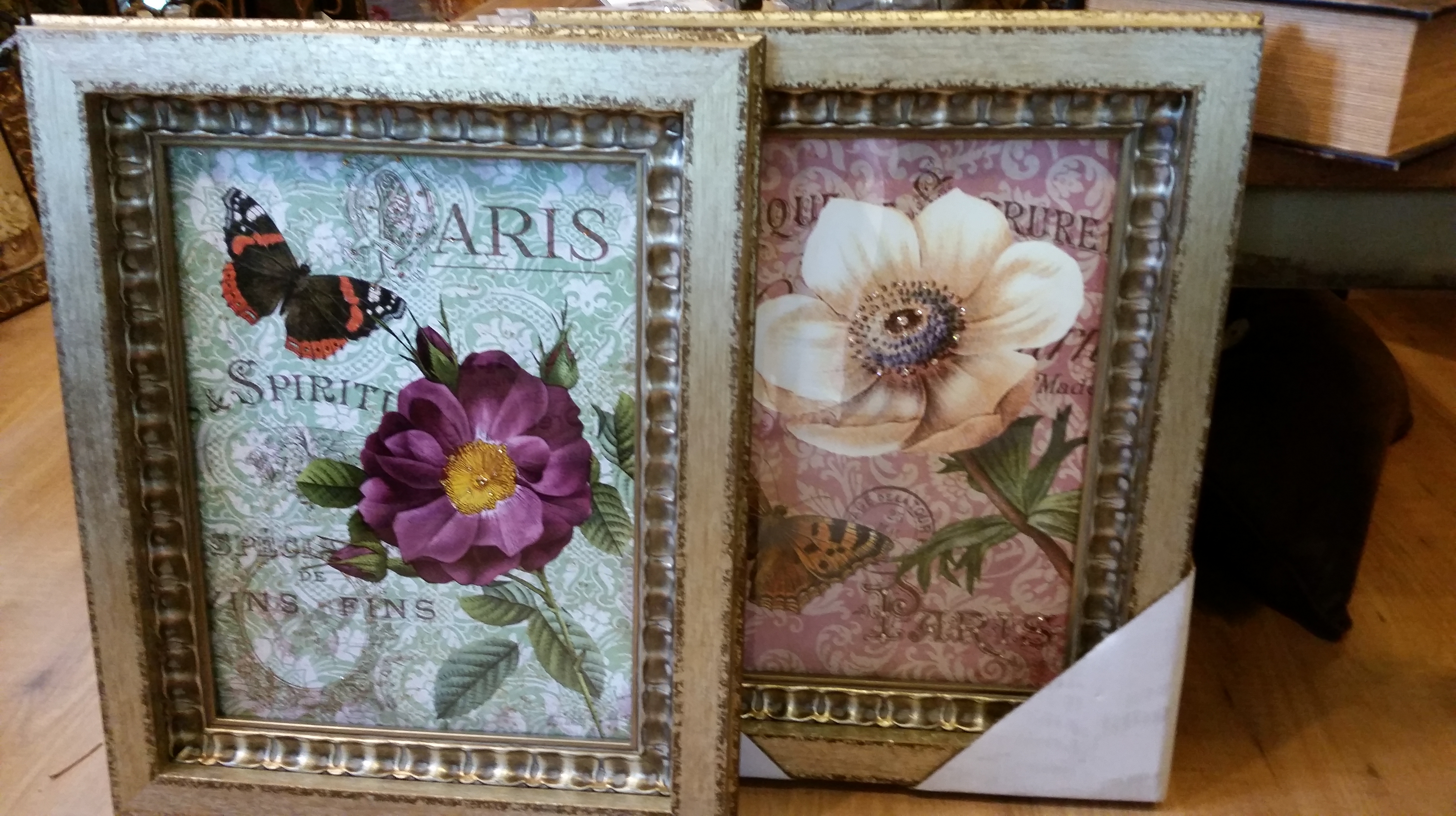
Floral with Swarovski crystals
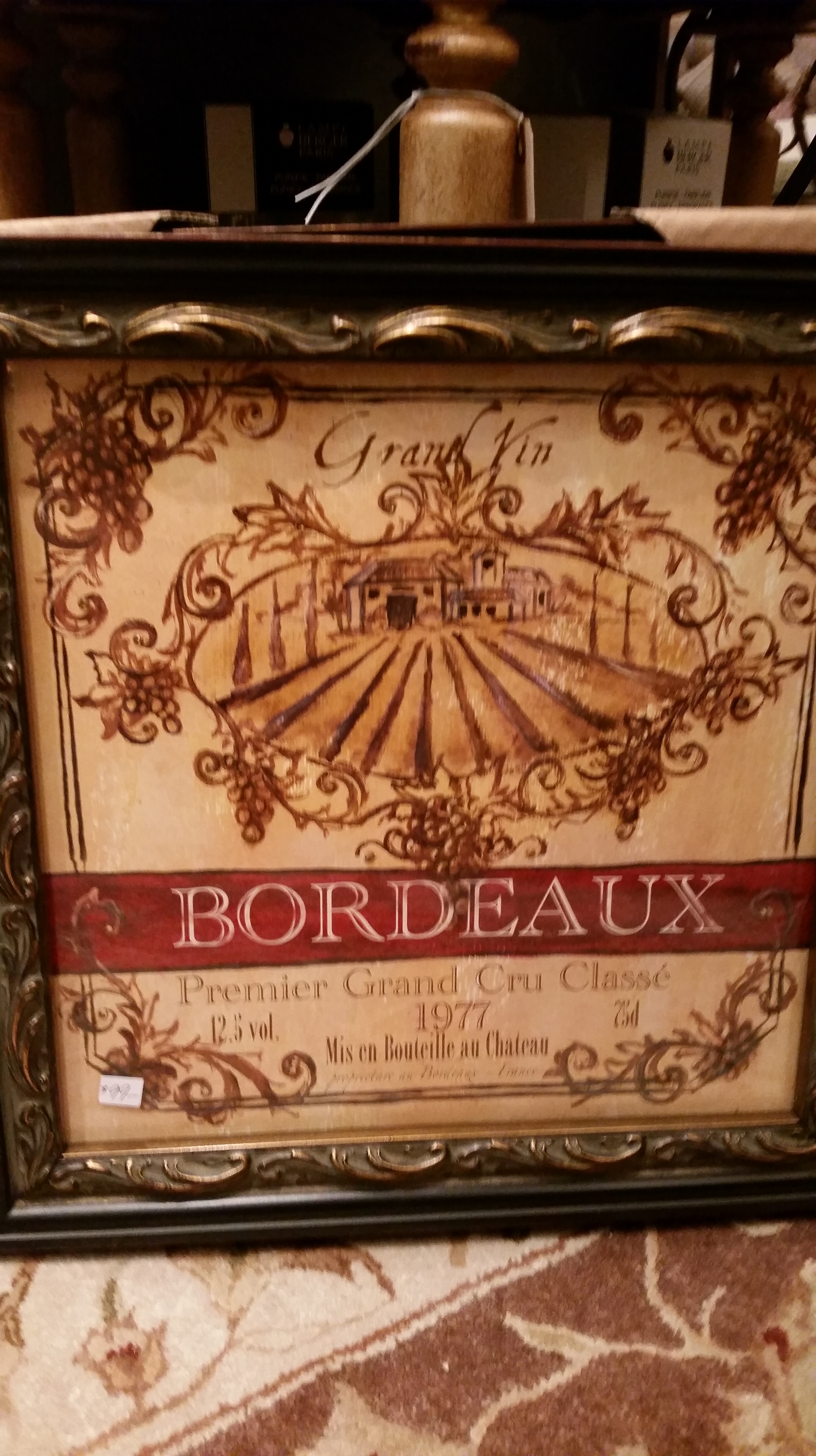
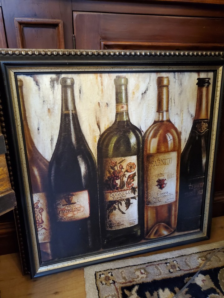
Wine Labels – Set of 4
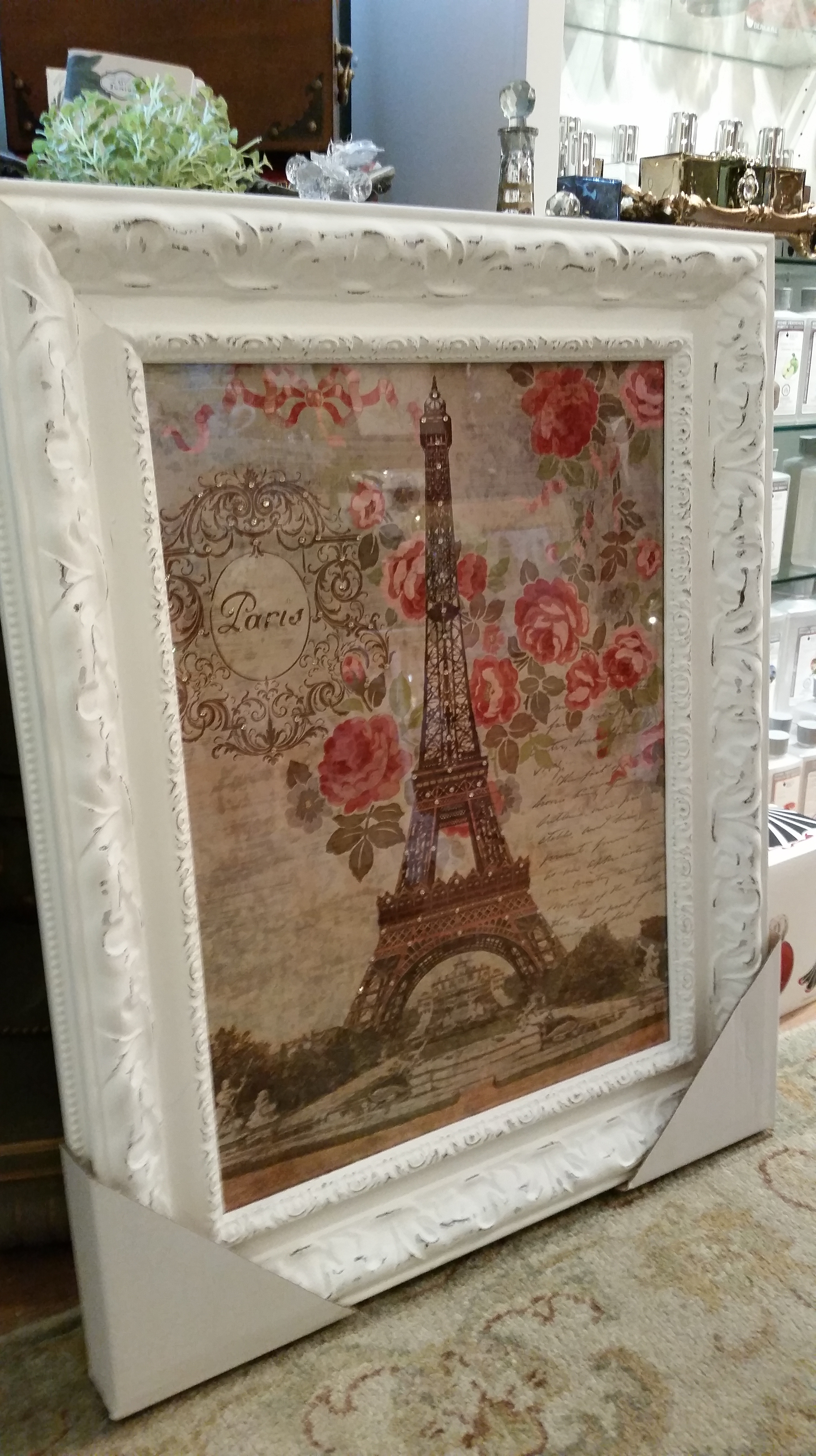
Eiffel Tower with Swarovski crystals
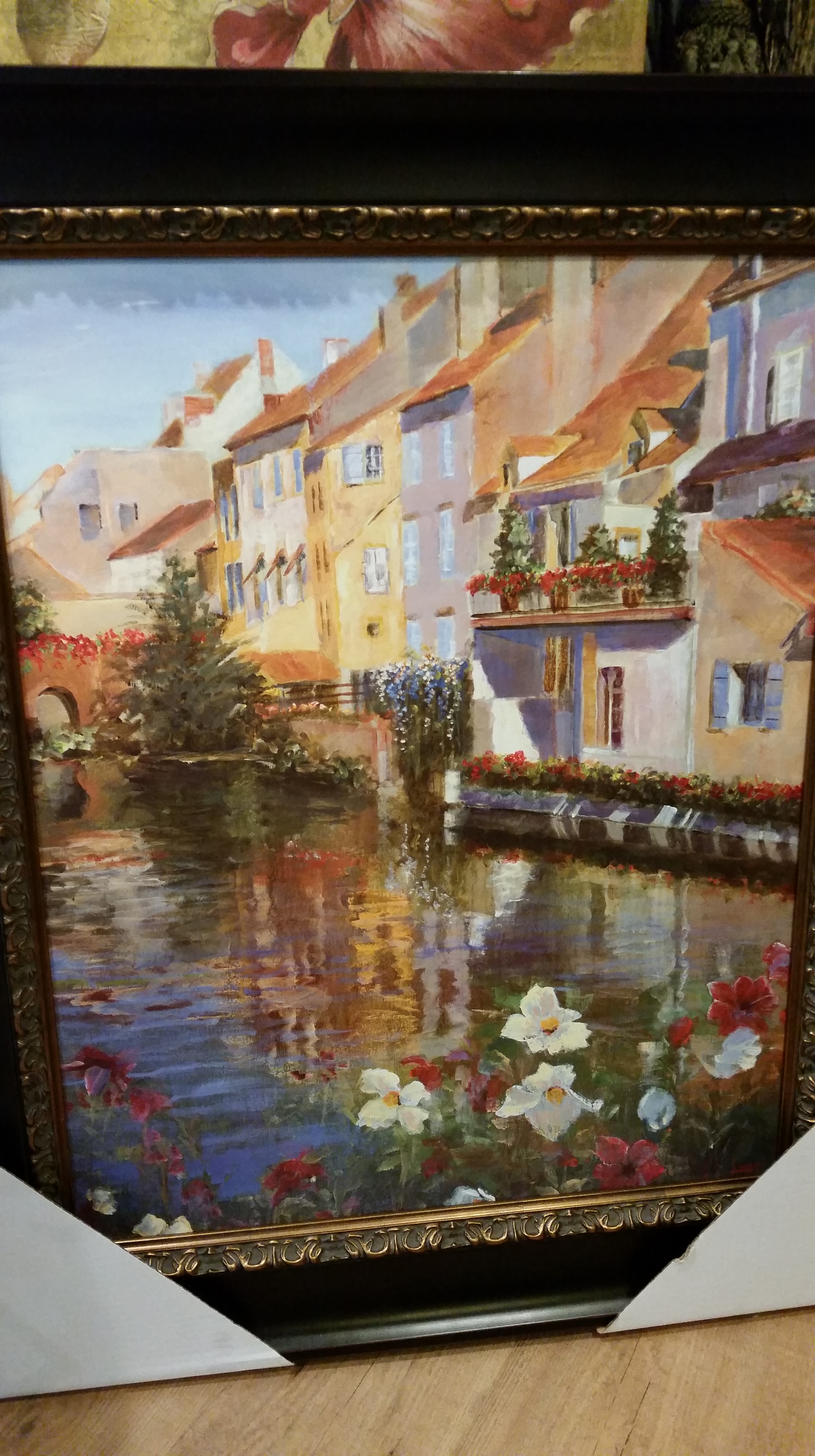
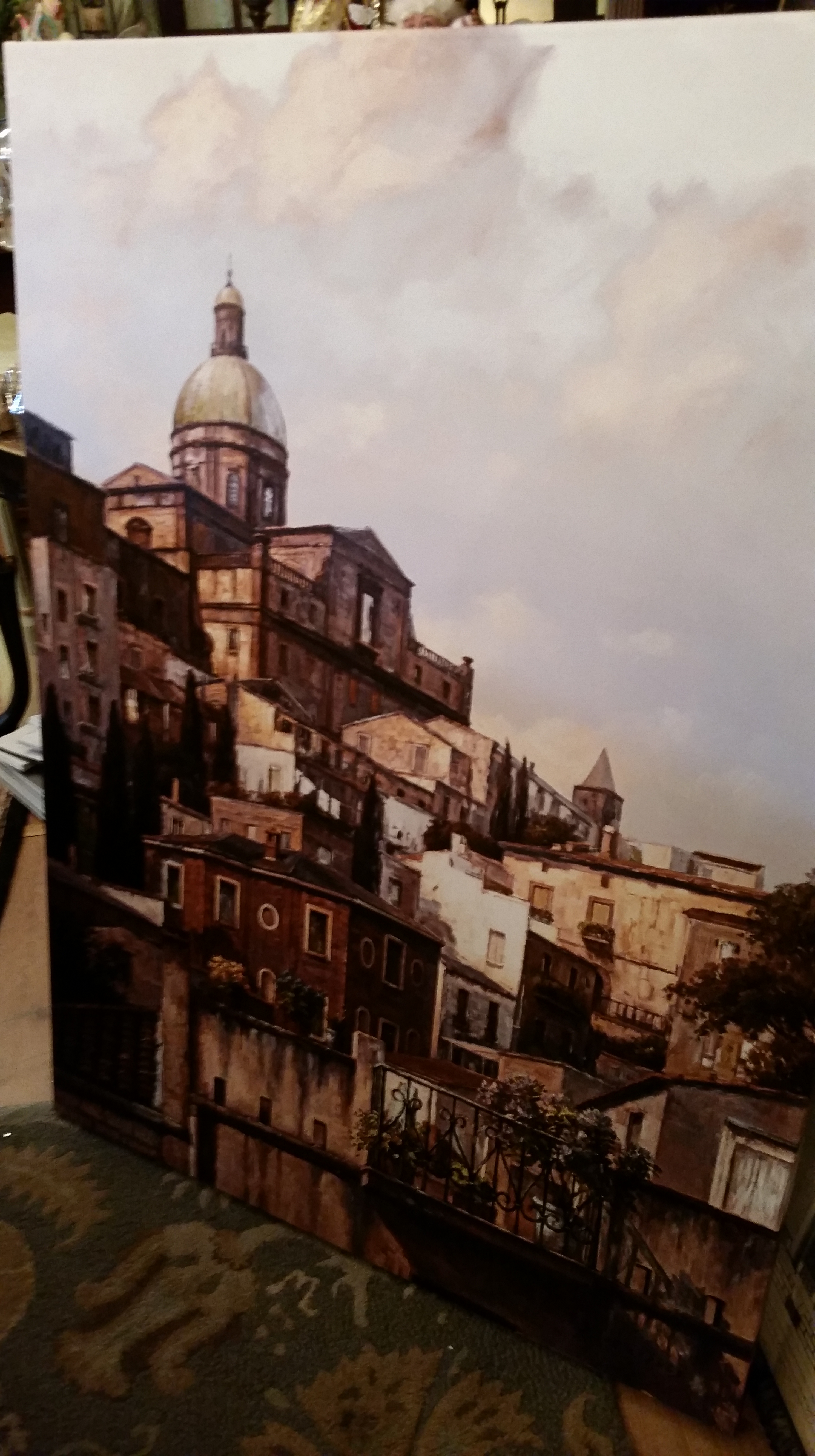
Tuscan Scene – this is a canvass wrap
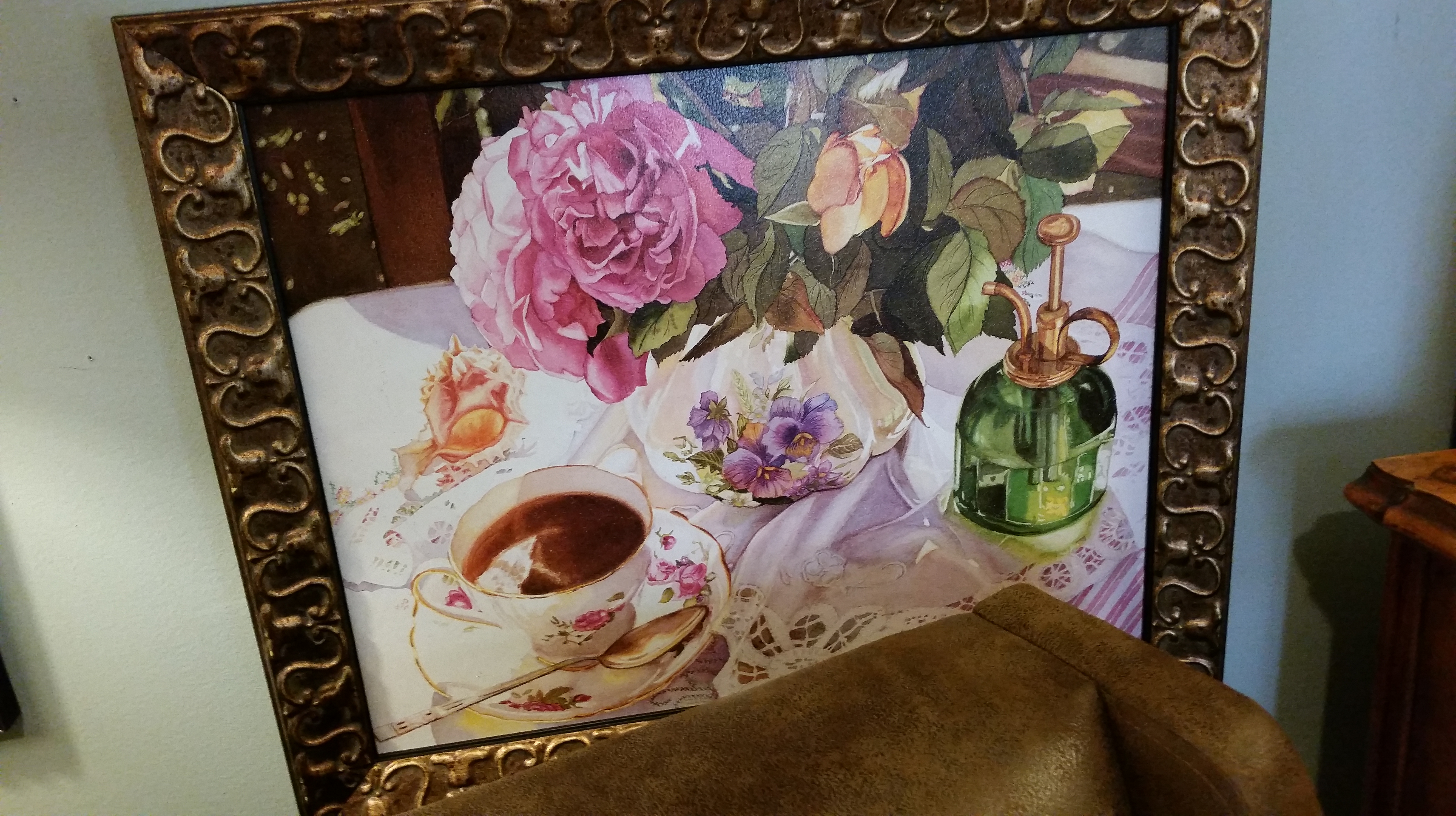
Tea Anyone? Love this one!
Walls are a big part of your home…and your home décor plan should include lots of beautiful artwork on the those walls.
We’re doing our part at The Whistling Elk! We have shipments of beautiful wall décor every other month! This month we brought in a double shipment so there are over 45 new pieces in the shop. Come check it out and spruce up your home décor!
This pretty piece of art makes me smile in its simple beauty – its a giclee so there is no glare of glass and I think that makes it easier to appreciate!
A shipment of art just arrived late yesterday afternoon. After the initial flurry of activity required to take in the shipment, unpack it and examine it then price it….I got to thinking of how the walls of a room define the space within it and how decorating the walls brings the room to life and enhances and complements the other furnishings.
I began thinking about how certain pieces of art just make your heart beat…and how the enjoyment of looking at them directly contributes to your feeling of well being and enjoyment in your home!
So on that note I am excited to share a few pictures of some of the art that came in….its a diverse collection this time…mostly smaller pieces but all beautiful. Maybe one or two will touch your heart and will take its place in your home!
This pretty print is embedded with jewels that sparkle and add to the beauty of the print – there is a companion print “madame”
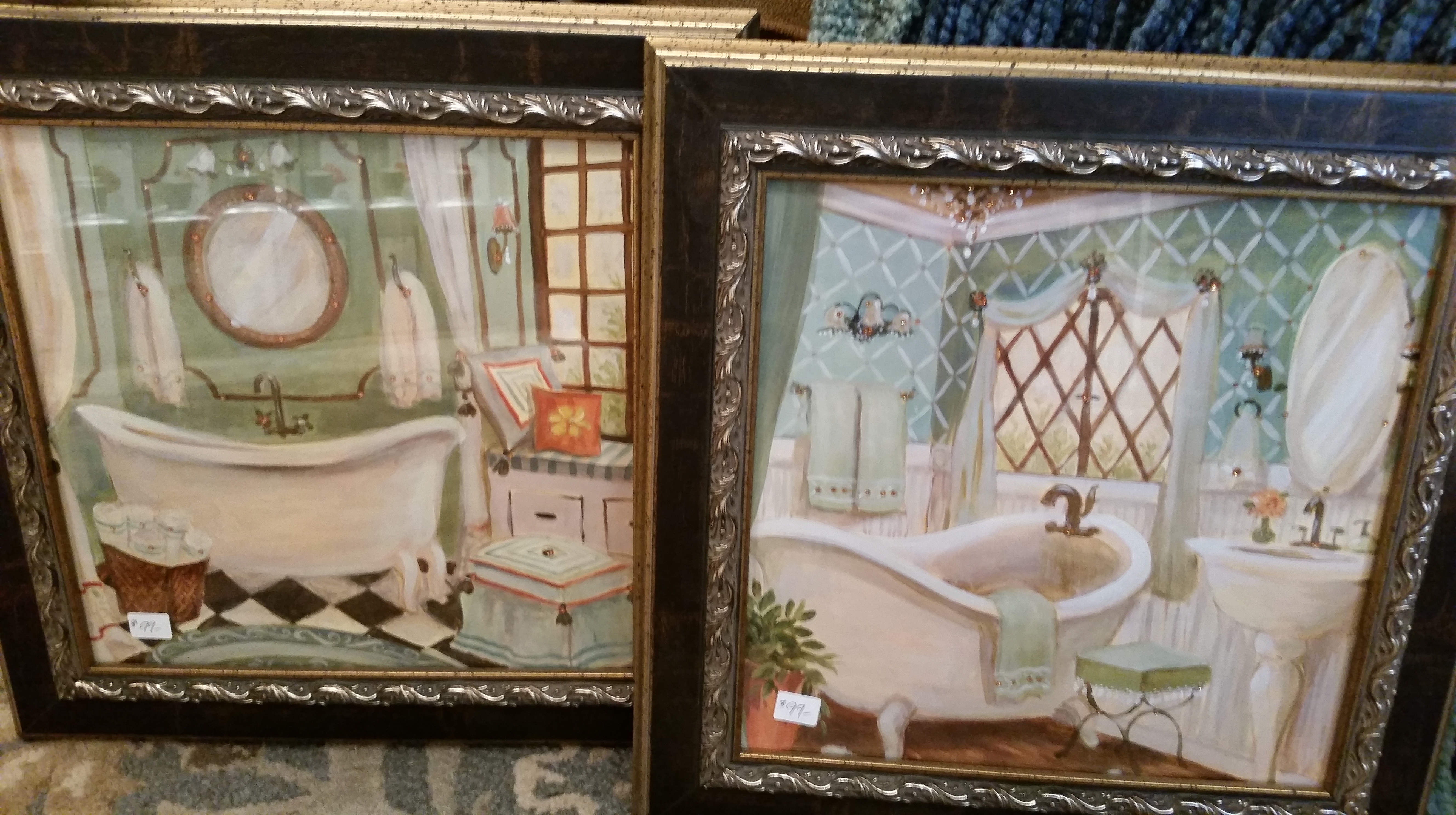
Love the Colorful aspect of these bath prints! There are 4 in the collection – all beautiful
This chandelier print has a companion print that showcases a different chandelier. Together in a Dining Room they would be spectacular.
We have some elegant crowns right now too…couldn’t resist putting one in the vicinity of this print….they just seem to resonate! The Chandelier print is studded with little amber crystals.
This wall has some many pretty pictures on it – all very different and yet all working together to form a lovely picture. The one in the middle is actually a mirror distressed and detailed with reverse painting on glass so it is reflecting the other side of the shop!
A pair of pictures that work in the kitchen, butlers pantry or breakfast room…they each have a mate (not shown here)
There are four of these pretty ballerina prints….all different poses studded with jewels.
I love these – they are so elegant and look very old…I like to think some ancestor of mine lived in one of these castles. There are 3 different castle prints – all beauties.
There is some diversity on the wall but it works in that all is beautiful!
There are more beautiful pieces in the shop so stop by and see what catches your eye!
Our artwork is always elegant, always beautiful and always 20% off every day.
We have a special promo going on right now at The Whistling Elk.
Now is a great time to jump in and treat yourself…or purchase some early gifts for the holidays and take advantage of this great offer.
I am always saying that Lampe Berger is one of my favorite products…and it truly is.
I love that it purifies the air and eliminates odors. It floats on the air throughout my shop (and my home) and creates a delightful atmosphere. Sometimes the scent will “hang” in the air in certain areas and when I walk thru them I just smile!
Lampe Berger at The Whistling Elk in Chester NJ
The Lampes themselves are so pretty! Make a design statement with the Lampe you select for your home!
Lampe Berger at The Whistling Elk in Chester NJ
The tortoise / leopard lampe above is very elegant!
So, you say, what is the deal? Well Lampe Berger has provided me with Tri-Packs of scent to give away with the purchase of any lampe (excepting the entry price point lampes)! The tri-packs are a $25 value for FREE and there are two different versions of three different scents. Supplies are limited so don’t wait to take advantage of this offer.
Special Promotion – Free Tri-Packs while they last
Oooh, and here is one more new Lampe that I Love…called Traditions! Very Beautiful!
Traditions Lampe Berger at The Whistling Elk
Already have a Lampe Berger?
Want a new scent? We are fully stocked and have “testers” here so that you can sniff a new scent before buying it. But if you are like me you already have a favorite scent…mine is Charleston – what is yours?
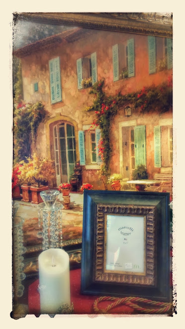
I love gorgeous artwork…the framed giclee in the background of this picture just arrived at The Whistling Elk.
I want to climb into the picture and sit at the table sipping wine…
Provencal Maison
Come see this piece in person – its 48″L x 38″h and will make a design statement wherever you hang it..you will love the way the light plays over the front of the maison…beautiful!
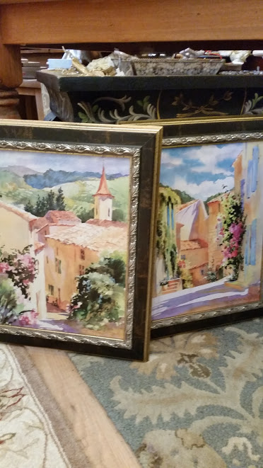
We have lots of other artwork as we just received a shipment last Friday…hurry though because it goes fast!
Here’s another teaser photo…these two are smaller giclee prints and feature lovely soft pale watercolors…
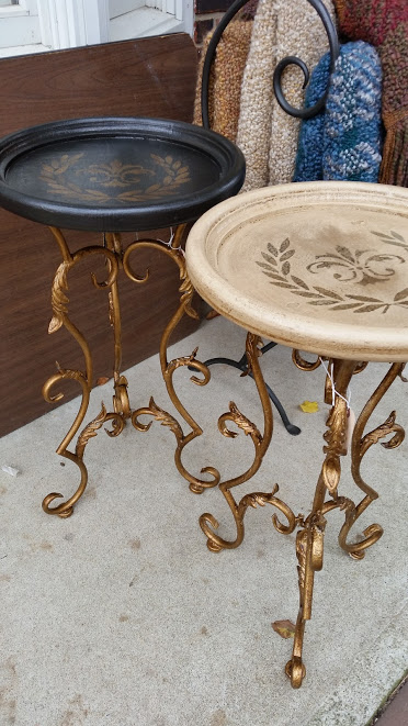
Just painted some pretty little tables…they are great accents for any room where you require a little table to put a glass or book on but don’t have a lot of space.
These two will go anywhere!
Pretty painted tables make great accent pieces. These are painted and crackled with Paint Couture!
I have always loved little accent tables like this – adding them to a room design is like putting on gorgeous earrings – with your pretty dress…a finishing touch!
You know how you always have a lot of little tiny pieces of gold leaf that are left over from a project…I can just never bear to throw them away…
Well I was painting up a finish sample that had gold accents and I thought I would try to use the gold leaf to highlight the pale gold areas. Wow I love it!
Paint Couture French Putty, Pale Gold, Italian Ivory and Van Dyke Brown with gold leaf
The finish sample is Paint Couture!™ French Putty all over, then accented in three areas with Pale Gold. After drying I applied a skant coat of Italian Ivory all over and then rubbed some of that off. To further increase the patina of the finish I brushed on a coat of Van Dyke Brown and rubbed that off. I love the way Van Dyke Brown looks in the cracks. It darkens the crevices like black but in a much warmer way.
I wanted the gold areas to pop so I took some of my tiny gold leaf pieces and applied them strategically to enhance the finish…then reglazed them with the Van Dyke Brown.
Voila…loving this finish! Hmmm I am looking around the shop right now to see what needs to have this finish on it…!
Join in the fun! Sign up for one of our Paint Workshops at The Whistling Elk in Chester NJ and learn how to create beautiful finishes for your furniture projects. We use Paint Couture! products and you will be amazed at the myriad of possibilities these wonderful products will make available to you!
I have decided to create “finishes” instead of “paint samples”. Hmmm, what does that mean you might ask…
Well I have a lot of paint samples that I created using paint stirrers…I have posted these at the time that I paint them. However, now when I “finish” something and I love the outcome – I paint a sample board too (for future reference).
This way when I talk to someone about painting a piece I can show them boards of more complex “finishes” rather than a sample of a color with a glaze. This may sound intimidating because the sample boards are usually combinations of more than two processes. But if you are going to paint a piece of furniture or an accessory dont’ you want that piece to be out of this world beautiful? Maybe its just me but I want something spectacular if I am going to spend the time – something truly unique – a signature piece!
so with that in mind….here is a white compote that I decided use as my first victim for this new philosophy…:
White distressed compote that I decided to give an elegant new life to!
For my Signature Finish on this piece I decided to use Paint Couture!™ Pale Gold, Vintage Flair and Brilliant White paint and Amber Honey Glaze.
This was a 4 step process – Below is the compote after the first two steps. First I painted the whole compote with Pale Gold. When dry I painted portions of it with Vintage Flair. The Vintage Flair coat of paint was what I call “skant”…a very light coat of paint that did not cover the gold entirely. I chose accents to leave completely gold (arms and the decorative band on the base).
Compote painted Pale Gold and then paint with a skant coat of vintage flair
Then I put a dry brush coat of Brilliant White over everything.
Brilliant White Dry Brushed over Vintage Flair
When dry I glazed the compote with Amber Honey Paint Couture Glaze as shown in the picture below I glazed heavily over the gold and then only wiped some off strategically here and there to give a gold highlight effect.
Amber Honey Glaze – The Compote is complete!
On the portions of the compote that were painted with the Vintage Flair I wiped off a lot of the glaze. On the inside of the compote I used a swirling motion to apply the glaze. The inside reminds me of the Universe…! Only there are no planets…hahaha.
I used a swirling motion when painting and glazing the inside of the compote to mimic the shape of the piece
Here is a side view of the finished product!
Compote is now finished with a complex “signature” finish!
Voila! A beautiful, rich complex Finish!
Attend one of our Paint Workshops at The Whistling Elk and learn techniques to help you create your own Masterpieces!
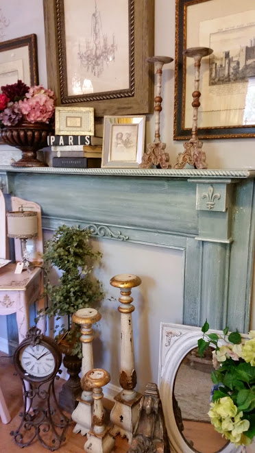
You may remember that I wrote a post on November 12, 2013 called “Mantel Madness with Paint Couture”. I had a lot of fun painting that mantel and it was beautiful…but I always knew that it would take on a new personality yet again some day…well that day has arrived! Here it is after I finished it the first time…
Mantel Painted with Abundance Paint Couture!™, Brilliant White and Verde Glaze Couture!™
I watered down some Paint Couture!™ Italian Ivory and brushed a thin coat all over the mantel…effectively whitewashing it. After it dried I got out my hand sander and beat the whole thing up! Gotta love that little hand sander.
Mantel after whitewashing with Paint Couture!™ Italian Ivory and distressing with my hand sander.
So now I have a “new” mantel…again! The Paris Boudoir is looking verrrrry nice!
Mantel refinished again with Paint Couture Products!
I have been posting a lot about painting lately! I guess I am pretty fascinated with Paint Couture™ products so I am really enjoying using them and teaching about them….but don’t be deceived there are always other things going on at The Whistling Elk. It’s the usual juggling act!
Freight coming in, new merchandise being unpacked and lots of garbage….grrr not my favorite activity. Lots of beautiful art though!
Art at The Whistling Elk
While I was painting the vanity … pictures to follow … I was also working on hanging new art that showed up…and my first hit of Christmas items…yes! Christmas…So anyway I’ve been working on this little vanity in between unpacking new goodies for the shop.
Of course the Christmas is “blingey” as usual!Ch
OK… Here is the little vanity…it is actually laying on its back on the floor….when I first looked at this picture I was thinking why can I see my feet….haha ! as usual I almost forgot to take the before picture and was starting work on it….
Paint Couture!™ at The Whistling Elk
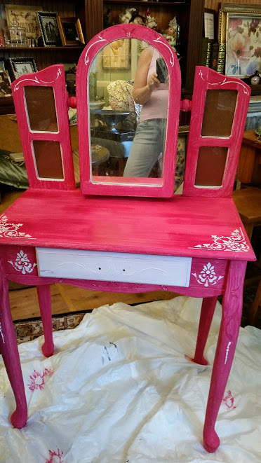
I wanted the vanity to say “pink’ and I wanted to use Paint Couture “LOVELY” but I was afraid it would be to faint….so I decided to undercoat it with French Polynesian Pink…hmmm that really did the trick.
Paint Couture French Polynesian Pink with some embossing started
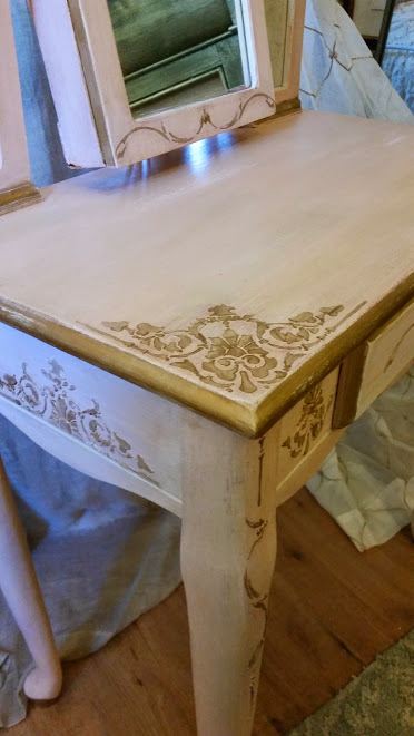
I did a lot of embossing on this piece and in addition added just some plain stenciling later to fill in some of the designs. I wanted a lot of embellishment on this piece.
Vanity with the Lovely over the French Poly then embossed and gilded with pale gold
I did distress this piece somewhat to show just a faint hint of the French poly pink. I also lined the piece wherever I could with Angelic Paint Couture to make the pink stand out even more.
Close up of the side detail
Vanity Finished in Light Brown Sugar Glaze Couture and Matte Lacquer
Inspiration is a wonderful thing…Good design is always based on inspiration… Sometimes you are on a design path and you take a right or left turn…in that case I know that something along the way changed my inspiration…
Painting is like design in that you start with an inspiration and then work in that direction…adjusting as the piece you are working on speaks to you…
The trio of pictures following was my inspiration for a dresser that I am just finishing up painting with products from the PaintCouture – The Collection™.
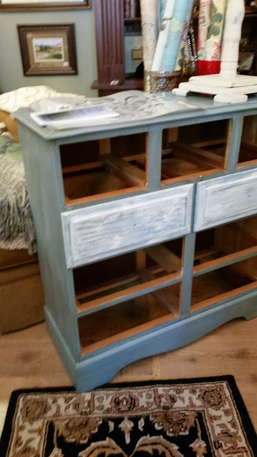
Ok, here is the dresser….BEFORE…it was a nice old dresser painted blue and the drawers were whitewashed. It was dirty from sitting around so I cleaned it with TSP really well.
Paint Couture™ is sold at the Whistling Elk in Chester NJ
Before I started painting the dresser I painted up a sample using the paints and glazes that I decided were going to achieve the look I wanted based on my inspiration…I chose the below Paint Couture™ products: Vintage Moss, Brilliant White, Lite Brown Sugar Glaze, and Pale Gold Metallic Paint and here is how they looked on the sample I painted.
painted frame using Paint Couture products based on my inspiration
So loving the way this frame turned out! I love finishes that have depth and look “vintage” – with a little of the dirt of age on them…ha! I couldn’t wait to start work on the dresser. It’s funny but this is one case where I never deviated from my inspiration…it was soooo clear where it was going!
First I painted everything with the Vintage Moss. After 24 hours I dry brushed the piece with Brilliant White. I then used the Paint Couture Embossing Medium and stenciled on some designs. This always takes some time because you have to plan your stencil layout. I used parts of two different stencils. After drying the PC Embossing Medium I laid my stencil back over it and applied PALE GOLD – Paint Couture’s beautiful metallic paint! (one of their many metallics)
Paint Couture Embossing Medium is Amazing.
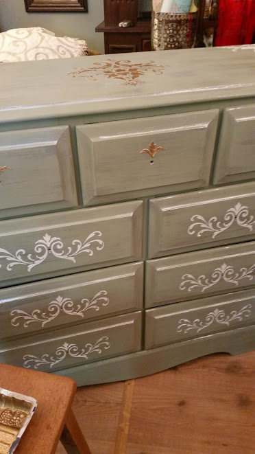
Dresser embossed and embellished with PALE GOLD Metallic. Paint Couture has great metallics!
The combination of the BRILLIANT WHITE and the PALE GOLD gives this dresser a metallic gleam…it sparkles!
Next I glazed everything with Paint Couture’s Lite Brown Sugar. It’s such a pleasure to work with – very creamy. I happen to be a light glazer…I would rather put it on and take it off and then glaze it again. I feel very much in control when I work this way. You can always go darker!
Paint Couture Lite Brown Sugar Glaze over Vintage Moss, Brilliant White and Pale Gold
You can see the French Polynesian Pink PC peaking out on the sides of the drawers…I love the pink with the Vintage Moss…I decided not to the glaze the pink – it is less subtle and I love the contrast it creates of the Bright against the Aged!
French Polynesian Pinks Drawers…I painted the outsides of the drawers because I thought this would show more than the insides…
After thoroughly letting my piece dry I applied a 2nd coat of Lite Brown Sugar Glaze. This really deepened the finish on the dresser. It’s very rich!
After the 2nd coat of Paint Couture Lite Brown Sugar
Pale Gold Embellished Embossing
Embossed Stenciling embellished with Pale Gold Metallic Paint
The Brilliant White reminds me of fairy dust and the Embossing Medium painted with Pale Gold makes this very ordinary dresser a piece of art.
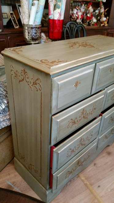
Painted Dresser with the Hardware back on
Hardware reapplied over the embossed design
Because I am impatient…I didn’t want to wait for new hardware. I didn’t really love the hardware that was on the piece originally but I decided to play with it to see it I could get to like it. So I planned my embossed stencil to enhance the hardware. I painted the hardware with Brilliant White, then Pale Gold, then glazed it and applied little crystals. I then hung it upside down to change the look of the design. I love it! It’s so not typical!
Paint Couture will enable you to create a masterpiece.
At The Whistling Elk we will teach you to paint your own masterpiece.
When I have paint on my brush I often look around for something else to paint since I have a paint can open and a dirty brush. The PALE GOLD was open and I had a little pedestal. It almost became my problem child. I knew the pedestal had wax on it so I had cleaned it earlier with mineral spirits and then TSP’d it. Woe is me. It wasn’t enough!
After I painted it with the Pale Gold it just didn’t feel right – I knew it was going to peel. So I sanded it down and of course there was still wax on it…sigh…curse…
I had some Mylands Sanding Sealer so on Mike’s advice (The Father of Paint Couture) I brushed on the Mylands. WOW. It.Worked.Great. I put it on over the remnants of the Pale Gold and after it dried you could just feel that the paint was going to be o.k.
I actually liked the way the pedestal looked all chippy and messy and now that it felt right too…it almost had me making one of those left design turns…humph…should I leave it that way???? But in my heart I knew that the really messed up look would not appeal to most customers. Here it is in all its chippy glory…
My Problem Child – This pedestal almost made me make a left design turn
I ended up having to clean that brush and put away the paint while the Mylands dried and I considered what to do. This must be my week for not deviating from plan…I ended up brushing on more Pale Gold, Embossed a stencil on top, Brilliant White went on the stencil only….then finished with BLACK WALNUT GLAZE all over…(my favorite Paint Couture™ glaze). Pale Gold with Black Walnut gives a very beautiful, deep and rich metallic finish.
Painted Pedestal – Paint Couture Pale Gold Metallic
I made the right decision. Its very beautiful and elegant and all it needs is a glass of wine sitting on it next to a comfy chair.
Come learn to create your own masterpieces at one of our Paint Workshops at The Whistling Elk. You will learn all the techniques described in this post and you will have fun!
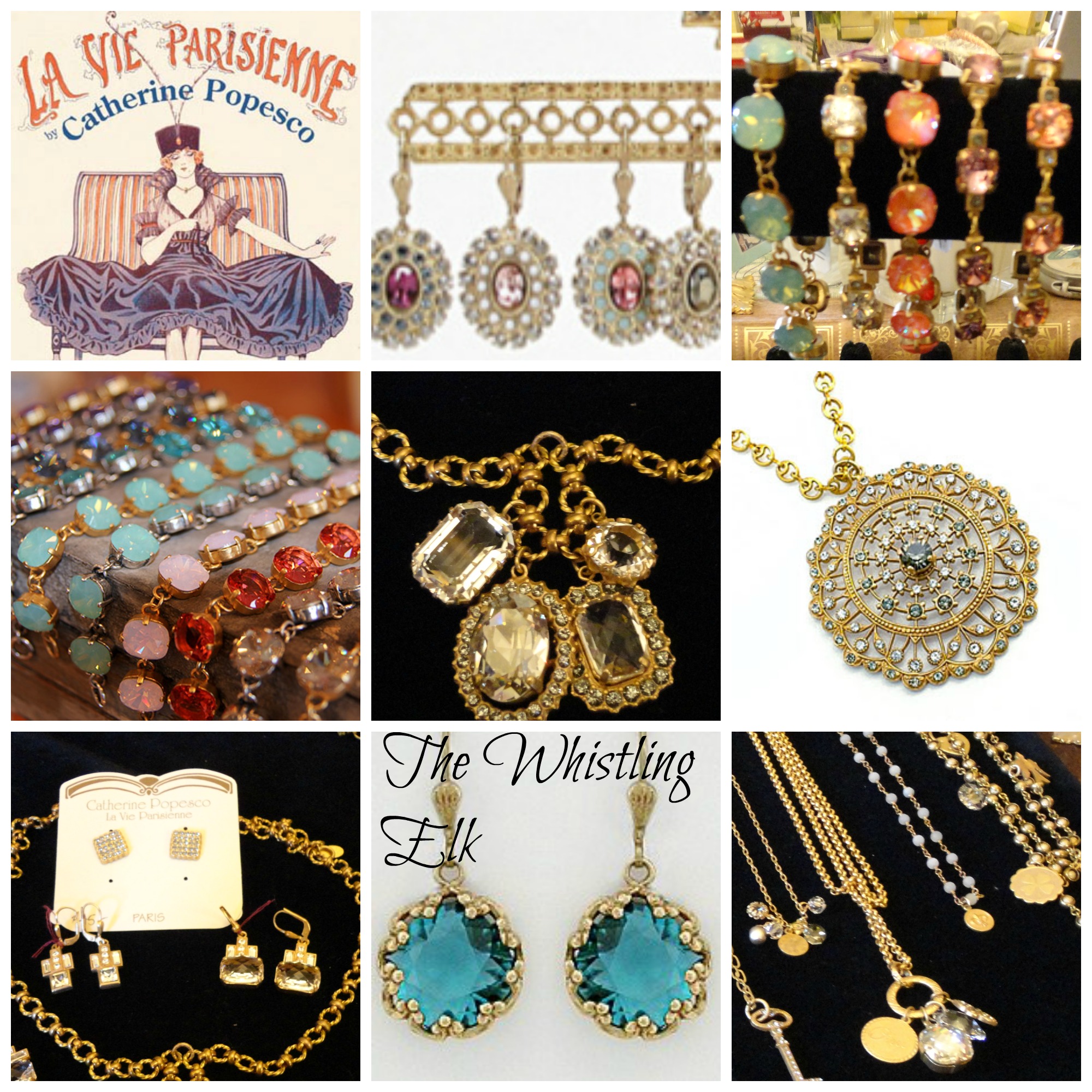
Especially the art deco earrings in the lower left box…oooh la la!
La Vie Parisienne Jewelry at The Whistling Elk, Chester NJ
The Collection designs are rendered from the original molds that were created by artists of the celebrated jewelry period from 1900 through the 1930’s combining classic European findings and a selection of historical American pieces which are handset with brilliant Swarovski crystals.
O.K. that is the company’s description of their work….I just say “It’s beautiful!” “It’s my favorite”…”it looks amazing when you layer it”… “you just plain can’t have too much of it!” So there!!!!
Oh, and it’s not too soon to be thinking about Mother’s Day! Yup…Mothers Day and Jewelry are synonymous.
and we are ready for Mom’s at The Whistling Elk with our usual complement of great home accessories and lots of intriguing little gifts & spring flowers.
I had a fabulous day today…I really love what I do and now I can even say I am a bit of a contortionist!
My client had an armoire that was a nonedescript green and she wanted to jazz it up but she did not want to (couldn’t) move it. So I gilded and glazed it in place…talk about getting into tough positions in tight spaces…hahaha…I am smiling just thinking about those back legs… Glad no one was there with a video camera…
Here’s the before picture…although as usual I started gilding before I took it!
Armoire Before Glazing with Glaze Couture!™ Amber Honey
and here is the finished product!
Amber Honey Glaze Couture!™ was perfect for the job.


Recent Comments