There is really nothing more beautiful to me than the elegance of a room design incorporating glorious colour and the changing winds of home decor are bringing colour back!
Warm. Cozy. Timeless
I can’t imagine anything better than that.
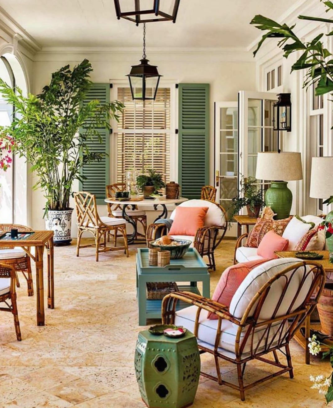
Lovely Florida home by G.P. Schafer featured in Luxe Magazine.
Designers who create rooms incorporating traditional looks with a few clean contemporary accents or some wonderful vintage or antique pieces take my breath away and make my heart beat. Beautiful design can always do that to me.
Obviously colour is a major factor in the design of all beautiful rooms. Although I enjoyed the grey/whites and accompanying pale palette that was trending...it is cold…Brrrh! I think that everyone staying home during the covid pandemic spent a lot of time looking around and deciding to make some changes in their homes especially related to reintoducing colour…putting the colour revolution on the fast track!
What do you think? Are you ready to move on to some great color and tradition? or will you holding on to the cooler palettes?
Change on the wholesale level is already in full swing so you are going to find less of the outgoing trends and colours.
Have you ever looked for home decor and accents in colors that have recently passed out of favor? Then you know how hard it can be to find them. When the market starts to transition it is always wise to finish a room before home accents become scarce.
Personally, I am wholeheartedly embracing the return of color!
Magnificent beach house foyer by interior designer Jack Philips. Photo by Brantley Photo
I love the way Janelle of Janelle’s Designs made this vanity stand out by incorporating Gold!
A touch of gold on gray makes this vanity stand out! Photographed and Painted by Janells Designs. You can find Janell on instagram @janellsdesigns
There is really nothing like a beautiful Traditional
room design.
Warm. Cozy. Timeless.
I can’t imagine anything better than that.
Amazing family room by Alexa Hampton Inc. Love the use of Color!!
Designers who create rooms incorporating Traditional looks with a few clean modern accents or maybe some wonderful vintage or antique pieces take my breath away and make my heart beat. Beautiful design can always do that to me.
Obviously color is a major factor in the design of the warm, cozy Traditional room. Although I enjoyed the greys and accompanying pale palette that has been trending...it is cold…Brrrh! So I am not so sad to see it trending down and away.
What do you think? Are you ready to move on to some great color and tradition? or will you be trying to hold on to the cooler palettes?
Once change starts on the wholesale level you will start finding less and less of the outgoing trends and colors. It takes a little time to transition and longer still for the retail customer to embrace the next trend.
Often customers will look for decorative accessories and accents in colors that have recently passed out of favor and they become extremely hard to find…sadly I’m sure that on occasion you have experienced this.
When the market starts to transition it is always wise to finish a room before accents become more scarce.
Taken from designer Michael Smith’s book “The Curated House: Creating Style, Beauty and Balance”.
Personally, I am wholeheartedly embracing the return of color!
…They ask this when they are standing in my shop amidst the furniture and home accessories that are displayed in The Whistling Elk.
I usually just shrug off this question because I have never really thought much about it – until recently…you see I just sold my home. A short few words but a lot of meaning!
Taking stock and packing I realized just how consistent I really am…there is a resemblance in that I really love to be surrounded by beauty. I guess if I am one thing…that is…Consistent !!
I have lived in my home for 28 years…it feels like a part of me. It always felt good just to be there. Over the years I have brought home pieces that I loved and integrated them into the mix. Some things came and went while others I cannot imagine parting with ever.
Living Room
My list of belongings reads like a list of the companies that I have done business with over the years in the shop.
I have a J.M. Paquet sofa…they are out of business now being one of the ones to go early in 2008. but the sofa lives on and when the time comes I will have it reslipcovered yet again. Its so comfortable and I still love it so it will go with me to my new home.
My Habersham buffet is another piece that I love. It makes me happy every time I just look at it. It houses my grandmothers dishes which will be going to my niece for safekeeping. The buffet though goes with me. The savonnerie carpet is from Feizy…and it was chosen because…well, I just fell in love with it.
I love this room and have spent many, many hours here! The mantel I bought when a 1890’s home in New Brunswick was demolished. It was a wreck all chipping and dirty. I took my hand sander and sanded all the dirt and loose paint off and then had it attached to the wall.
Since I have always wanted to live in an old fieldstone house I mimicked that with the faux painted fieldstone wall on which that mantel is mounted. I loved this look and am sorry to leave it behind. I guess I will have to paint a new wall!
1890’s mantel
Another favorite room is the Master Bedroom…and Master Bath off of it…
I purchased a really crummy pair of shutters and nailed them to the wall on either side of a large window and it created just the right look to go with the Dutch Caribbean bed. I cannot remember the name of the company that this bed came from but it is solid hand carved mahogany.
Another Favorite Room
The beautiful painted lingerie chest fit just perfectly in the corner of the room…it’s shape is what makes it special. It’s rounded across the front. It came from RH Home…they were a California company which is also gone. Sadly.
The walls I faux painted to resemble my take on old crumbling Italian walls…and you can’t see it in the picture but on the wall at the foot of the bed is a huge 5 foot x 4 foot picture of a hotel on Lake Como Italy which I have to say I loved waking up and seeing every morning. Perfect way to start the day!
The Linen Press next to the bed is an antique piece from England circa 1880…my niece will be picking up this piece tonight and it will go to live in her bedroom. It came from a company called ARK Antiques which is also out of business…so many great companies over the years have come and gone. Sadly our economy is not good for small business these days.
Master Bath
I really got fanciful with my master bath. The Alma Slade draperies are chenille and were perfect with the colors in the Nourison carpet. But my favorite piece is the Danish Vanity from ARK Antiques…circa 1910. So pretty! And of course I just had to have a little vintage chandelier in there…Right? Absolutely!
I have a thing about old doors and I managed to get my fix with that too in the dining room where I leaned two heavy old French doors to flank a 3 panel screen…an oil from Andrew Kolb & Sons depicting a hillside village in Italy. That’s the only non-bling (Stone County Ironworks) chandelier I own over that table!!! I always meant to hang some crystals on it…
Dining Room
So I guess this is my tribute to my pretty little home that I am leaving behind. I will miss it. A little place always filled with light from all the large windows. But I am also so excited to start over and to what I am going to create next!
I have a door in the shop that leads to a little foyer and the back door.
Before I got my hands on this door…it looked like this!
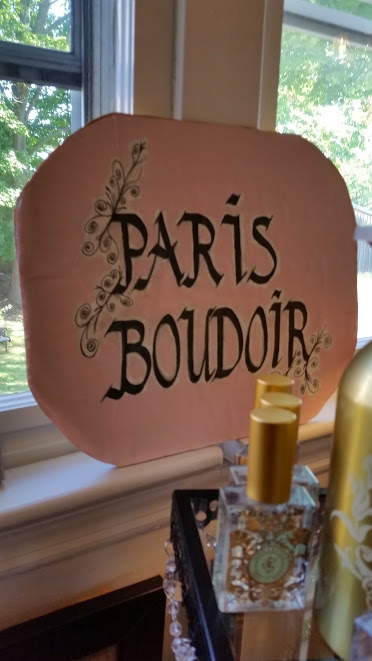
The door is in my little “Paris Boudoir” so you can see that it just wasn’t making it in its “silly brown” color…
Paris Boudoir at The Whistling Elk
I like to show my customers what they can do with Paint Couture!™ but I keep selling the pieces that I paint so I decided to paint the door…my landlord would not like it if I sold his door so I figured it was safe to paint it with Paint Couture!™ in order to have a ready sample at all times!!! P.E.R.F.E.C.T.
So the door got a very light uneven coat of Italian Ivory with Dream in the area around the raised panels of the door and Pale Gold on the moldings around the raised panels.
Remember the movie Romancing the Stone when the smuggler says he’s going to get his “li’l mule” and smiles…well I feel that way about my li’l hand sander. So yup I got it out and beat up that door! I did get a little carried away on the “back side” of the door.
Paint Couture on the Paris Boudoir Door at The Whistling Elk, Chester, NJ
Yesterday I stenciled the front side of the door with Pale Gold…but I couldn’t decide if I was really done…that happens a lot when I paint.
Sometimes when I am not sure about how I feel about something – I go home and sleep on it – it never fails that when I wake up I have the answer…actually it came to me before I even got to sleep…A Door Has Two Sides…who said they have to be the same?
This morning when I came in I glazed the back side of the door with Light Brown Sugar on the raised panels…lightly rubbed in. Then I glazed everything but the raised panels in Champagne. Ha! I used some different stencil designs so it looks completely different than the front side.
Paris Boudoir Door Front
Back of Door with light brown sugar on the raised panels and champagne glaze on the frame.
So now I am having one of those moments where I am thinking, Yah, you can have your cake and eat it too!!!!
Mirrors make such beautiful design statements…now take this one for example….the top is just breathtaking.
And the finish is wonderful because its a champagne metallic….a little gold…a little silver.. and just the tiniest bit of black.
You can put it almost anywhere (that it will fit – it is tall at 63″) and it will blend into almost any color scheme. It will add an architectural element to your room. Of course the “old world elegance” makes it look like you carried it back from les puces de saint-ouen. Mmmm let’s go back!
Beautiful Iron Scrollwork makes this mirror extra special 63″h x 43″ w
There little ovals are perfect for powder rooms….at 31″ L x 25″ w but they will make for a pretty collage too mixed in with some great artwork.
Pretty Oval – simple clean lines with just the right touch of embossed decoration
Oval Mirror in black with a little gold accent
This last mirror is one I have blogged about before. It is so elegant and versatile. You can lean this 73″high mirror or hang it. You can hang it vertical or horizontal – design your room around it! Simple.Beautiful.Elegant. Perfect!
Good Lighting makes a huge contribution to the beauty and functionality of a home. And the addition of beautiful fixtures – chandeliers and lamps – creates delightful design elements in any room. Whenever someone tells me they have recessed lighting and don’t need any lamps the designer in me just cringes at their lost opportunity.
Having just received some new lamps in the shop got me to contemplating lighting and thinking about my own home so I thought I would share some lighting information with you.
Beautiful Lamps at The Whistling Elk (The red damask shade is opaque and you can see that the light shines down)
10 Lighting Tips
A truly beautiful room will tend to have soft pools of light that come from a variety of sources – Use lighting with different wattages and and place light sources at various heights.
Picture found on Geisen Designs website – shows well balance lighting all around the room and at various heights.
Position lighting all around a room to dispel dark corners.
Table Lamps are excellent decorating tools…use them even if they do nothing! They are not actually doing “nothing” because they are creating great verticals which enhance the beauty of any room filled with horizontal lines.
In a lamp that has double bulb sockets use two different wattage bulbs and you will create a medium and low setting!
Lamp shades that are opaque will create a more dramatic atmosphere as they throw light up and down and emit little side light.
Fabric shades will create the warmest most glamorous light.
Picture from Homedit.com shows the warmth of light emited by fabric shades
Paint your outlets to match the walls to minimize the distraction of cords and outlets. Have lamps wired with clear or fabric cords.
When placing a reading lamp the height is lower than seems intuitive: it should be below eye level so it lights your page, not your head.
Albert Hadley said “I personally try to avoid all ceiling lights because i think that overhead light is a tragedy.” Well I agree with that in reference to recessed lighting…but as to chandeliers – What could be more beautiful? A general rule of thumb for a dining room chandelier is 30″ above the tabletop. Bulbs should not be bright…lower wattage is better for creating ambience around table gatherings.
Dimmer switches go where you want to be able to create ambience.
The bottom line is that lighting needs to be functional but it can take a room to another level if you think in terms of ambience and beauty. It’s an essential design detail!
I have been working madly to plan for the next four days….so much fun!
I leave tomorrow morning – so the shop will be closed for 4 days while I am gone…
Having just completed a major floor move in the shop — I am ready to fill in with new exciting merchandise.
The shopping words for this season are OPULENT and GLAMOROUS!
Oh so exciting!!!
Schnadig Sofa
The shop is set up with a completely different floorplan for 2014. This pretty Schnadig Sofa is taking center stage in the shop….Its so pretty and versatile. You can go in so many color directions with it…in fact you can change the colors for the seasons of the year by using pillows and throws in colors you choose. It’s so reasonable in price also!
The Whistling Elk – Wall art
Space is at a premium in the shop so every inch of wall space must be used to display the art work … here’s one of the collage walls (with a floor lamp shade showing in the foreground). The artwork at The Whistling Elk is always 20% off so its a good investment and as you know we all have lots of walls!
Paint Couture! embellished mantel
You may remember my post regarding the painting of this mantel…I used Paint Couture™! paints and glaze to make it so beautiful…but I think I am going to re paint it for the spring. That’s right! Another mantel facelift is on the way…I just have to settle on color. I am thinking of doing something with the Pantone Color of the Year 2014 – Radiant Orchid….that would be something with Brilliant White over top! WOW…just sayin.
Soon we will begin our Paint Workshops again – so keep posted and plan to attend to learn how to paint furniture!
Pine Cone Hill at The Whistling Elk
Our Paris Boudoir is still the room in the shop that everyone wants to move right into! The bed is layered with Pine Cone Hill products – why? because it is such a well priced bedding line…love it! Lots of soft soothing color combinations for the bedroom. I’ll be visiting Pine Cone Hill in Atlanta to see what is new for 2014. Meanwhile still loving this soft palette of color including Madeline Café au Lait, Louisa, and Candlewick designs.
Home Accessories at the Whistling Elk
Sometimes the things that really make a room are the little things…like a sweet arrangement of glasses on a tray, a cocktail table book strategically placed to accent some colorful flowers! The tray is actually my favorite thing right now…its antique silver with a mirrored base…which has been antiqued to look so old…just love it!
Well my head is swirling with all the things that I am going to be looking for at market…all the plans, colors, objects and vignettes to come. Can’t wait to translate it all to the shop floor so that you can share in the excitement for 2014.
painting architectural details to stand out
I am working on a table right now with nice architectural details…cant wait to see it finished!
Tomorrow is the spring Chester Craft Show…We are going to showcase some of our painted furniture during the show. You can also sign up for our Paint Workshops…the next one is June 13th at 5:30 pm. Call for more information 908-879-2425. Space is limited so you must register and leave a $50 deposit.
These are fun informal workshops! The June 13th class will cover chalk paint paint finishes and introduce Paint Couture! our new acrylic paints…in total you will learn 5 different finishes and leave thinking about all the great things you are going to do with furniture you have in the garage or basement. You will be creating masterpieces…
The top of this piece is actually going to be black…and i have a lot more gold to apply. Its going to be stunning! And to think it was stashed in the basement…
and its not even finished yet…
Spent a few minutes working on the table today.
Filled in the center of the table with a design i made by using parts of 2 different stencils.
Mixed some Annie Sloan Old White with water and washed it over the whole table (originally black coated with old ochre) softening it, giving it dimension and a cloudly look. It’s ready now for the antiquing process which may happen today or tomorrow depending on how my day goes.
It’s hard now to believe that it started out black and even though its not finished it has really taken on a whole different character…
its soooo pretty and dainty now – hard to believe its the same piece!
It’s just amazing what you can do with paint and a little imagination. Is Painting in your design plan?
Today i started working on this round table. It has what i call “good bones” – that is architecture that sings! (to me anyway).
it was completely black with an oak grain to it. I covered the whole table with Old Oche Annie Sloan Chalk Paint. When it dries, i am going to hit it again with another coat.
I want to make sure i cover the black with a good solid coat of paint!
Tomorrow i am going to give it yet another coat…but of pure white. The Whistling Elk is turning into my own private paint workshop where it seems every day now something is being newly designed…
I just found a great ceiling medallion stencil that i am going to tailor to fit the top of this table. Ooh la la! This table is going to go in our Paris Boudoir when complete and will feel so soft and elegant that it will be unrecognizable. Can’t wait til the next step tomorrow!
Do you feel like painting yet?
This wall mounted bookcase is in my guest bedroom. It’s from Elden Collections. I have always loved the architectual feeling it brought to the room. Since i just finished painting the room Ben Moore Adagio i decided to give the bookcase a facelift. Since the room is going in a shabby chic direction i went with Decorator’s White advance semi gloss. This is a fairly new trim paint from ben moore that is water base but it paints on like oil base…love it and the finished product!
I have been in the new shop location now for one month and yesterday i received my first large freight order…in the pouring rain with nowhere to conveniently take delivery. I must say you can get pretty innovative when you have too. But i do miss the basement at my old location. Sigh…
The arched mirror above is one of the large mirrors that came yesterday…its very shabby chic and looks great in the Paris Boudoir.
This one i had stashed away but since we sold a piece of art…it got a chance to hang on the wall. What a crime that i didnt hang it sooner…
Here’s another one that is now unpacked and leaning on top of a beautiful habersham console. It’s one of my favorite mirrors.
I fell in love with this little table while out searching for antiques….
Its not old – just cute with great character! It’s oval about 16 x 12 and was already painted with Annie Sloan Paris Grey. It also has a marble top – black with a little pink and grey.
As soon as i saw it i knew i was going to paint and gild it! It was just a matter of what color…
oval table detailed with annie sloan chalk paint
So naturally i did paint it – it wasnt even in the shop for 24 hours before it got a makeover!
So here “she” is wearing some Annie Sloan Henrietta over Paris Grey….and then rubbed with some silver gilding wax and some kings gold gilding wax.
This little table had a dark wood top…it really had style with those cute legs so I decided to just paint the top with some Annie Sloan Pure White.
I left the legs the way they were – so here is the table with the Pure White on it.
Table with Annie Sloan Pure White top
I waxed it with the clear wax and then applied a little dark wax then distressed it.
Last i hit it with some of the gilding wax then distressed it some more…
Now it has a whole new life!
Love it!
Small Painted Table – Annie Sloan Chaulk Paint
I also worked on this standing mirror…it had a lot of “design” potential!
One of the reasons i selected this piece to paint was because of the beautiful wood carved crown at the top…
and the way this mirror resembled a “boiserie” panel…
The way i envisioned painting this piece i knew that its architecture would be greatly enhanced by using two colors to create a contrast.
I knew that using an alternate color on the crown and on the inset panel would work beautifully
and that connecting them by hitting part of the molding with the contrast color would be very pleasing to the eye.
So, i decided to use Paris Grey and Pure White.
Here’s the crown with a little Paris Grey which i purposely slapped on so it didnt cover all the dark wood.
Later i put some Pure White sloppily over the Paris Grey – i didnt care about covering since i knew i would distress it heavily later.
Crown Top of Standing Mirror with Paris Grey coat of Annie Sloan Paint
Originally it was also part of my plan to highlight this piece with some gold wax accents.
However, a customer came into the shop
while i was working on it and asked me not to put the gold on until she saw it finished with just the white and grey…
she thought it might work for her just that way…so i will have to wait until tomorrow when she comes in to see whether it will go home with her sans gold wax..
Here it is BEFORE distressing…
Standing Mirror in Paris Grey and Pure White before distressing
I painted the body of the piece all Pure White then applied the Paris Grey over only the molding and on the inset.
I did that because i knew when i distressed it i would get the dark brown and the white thru the grey.
Annie Sloan Paint on Mirror before distressing
Here is the boiserie mirror after distressing…I am just dying to highlight it with gilding wax!
Standing Mirror wearing Annie Sloan Chaulk Paint
Here’s some close ups of the details of the newly antique mirror!
Standing Mirror Top Detail
Annie Sloan Paris Grey and Pure White
When i am painting i find myself working on a lot of projects at once…
if i have a can of paint open i generally use it on as many pieces as i can so i dont have to open/close the paint, clean the brush etc.
it may be that i am just lazy…. but i think its a good idea to use the paint on something else while the can is open…
so here’s a little mirror that i also worked on!
Oval Mirror Before Annie Sloan Pure White
This distressed mirror was a brownish/cordovan kind of a color with some gold in the corners.
I just went ahead and coated the whole frame with Annie Sloan Pure White, Clear waxed it, distressed it and then
hit it with some of the gilding wax.
Oval Mirror Annie Sloan Pure White Chaulk Paint
Here it is all done and ready for me to put in Little Paris so perfect for my shabby chic shop!
The Annie Sloan Chaulk Paint has been a pleasure to work with and i am loving
all the new decor created…a very good product for interior design!


Recent Comments